
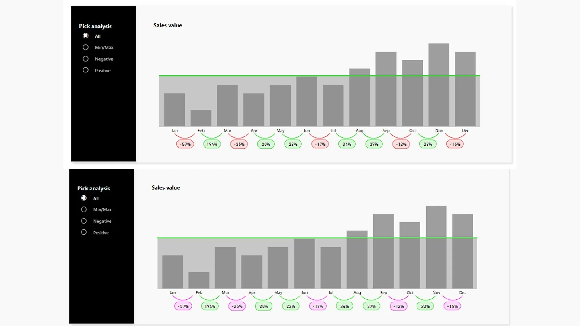
2D vs 3D data visualization.
Why your brain prefers depth over flatness.
For 300.000 years, your ancestors survived by navigating a three-dimensional world. They spotted predators in tall grass, judged distances by depth. They understood elevation, what is higher, what is lower, what is near, what is far. And that all wasn't optional, it was survival.
Then we invented spreadsheets.
We took that exquisitely tuned three-dimensional processing engine called 'the brain' and asked it to understand abstract, flat representations of data.
We said: 'Here's a line chart. Here's a bar chart. Here's a table.' And act surprised when understanding requires effort.
So maybe, there is a reason we feel drawn towards 3D visuals more than 2D.
The clarity trap
Before you think that I am declaring war on 2D, absolutely not! A well designed 2D visualization is undeniably clearer for precision.
When you need someone to read exact values - to extract the number itself from the visual - 2D wins. It removes visual noise, and forces clarity by brutal simplification.
If your dashboard's purpose is: What are the exact figures for Q3 revenue?, then a clean 2D visual in the form of a bar chart or so is doing it's job perfectly.
But clarity and precision are not the same as comprehension.
A 2D chart might be technically correct but precise information and understood information are separated by a chasm most organizations never cross. An executive can read the exact number and still mis the story. They can see the data and still not see the meaning.
This is where we've built dashboards that are mathematically perfect, and cognitively impossible.
(and yes, this goes further than just 2D vs 3D)
The spatial advantage: 3D speaks to your stone-age mind.
When your brain sees spatial depth, layering and elevation it understands it immediately.
Spatial relationships are intuitive, not learned. So there is less legend scanning required, less mental translation.
When you see a bar chart that moves in depth, you instantly grasp and memorize the trend. It's not abstract, but physical.
This is the 3D advantage at the perceptual level: Your visual system processes spatial information faster than it processes abstract symbols.
So even though it is often stated that 3D visuals add onto cognitive load, you're also offloading cognitive load. Your brain just sees it.
Perception vs precision: the trade-off
But 3D has a cost. And pretending it doesn't is where bad 3D lives.
A 3D visualization can make precise value reading harder. You might not read the exact height of every bar. The angle, the perspective, the depth—these can obscure the precise number. If your audience needs to extract that number, 2D is faster and more reliable.
So what's 3D solving for?
3D is solving for pattern, trend, and relationship—the shapes of your story rather than the individual data points that compose it.
When your brain processes spatial relationships, it's doing something different than when it reads numbers. It's pattern-matching at a deeper level. You see the shape of the progression. You grasp the magnitude of the change without calculating it. You notice inflection points where the story shifts. You understand the relationships between dimensions because they're expressed spatially rather than abstractly.
This is the perceptual advantage: Your brain processes spatial patterns faster and retains them longer.
The Memory Effect
Here's what we measure but rarely talk about: retention.
After someone sees your dashboard, what do they remember? Not the exact numbers. Nobody remembers that revenue was $4,237,492 in Q2. They remember the story.
We were climbing through the first quarter. Then we dropped hard in June.
This region outpaced the others by a huge margin.
We saw three distinct cycles in customer acquisition.
These aren't precise statements. They're narrative statements. And spatial visualization is specifically designed to make these narratives stick.
When data is presented spatially—with dimension, elevation, layering—viewers remember the shape of the story. The brain encodes it not as "numbers I need to recall" but as "a spatial pattern I've experienced." This is why 3D dashboards often have higher engagement and better message retention. You're not asking people to remember data. You're asking them to remember a space they've mentally walked through.
The engagement boost isn't superficial. It's cognitive.
When 3D Is Strategic, Not Just Stylish
Context changes everything.
If your dashboard is built for exploration—for an analyst who needs to dig into anomalies and extract precise values—then 3D might be working against you. Precision matters. You need 2D's clarity.
If your dashboard is built for presentation or storytelling—for an executive synthesizing insights, for a team understanding a trend, for a stakeholder grasping the shape of the business—then 3D is speaking the language your audience's brain already understands.
Spatial metaphors require no explanation. Stepping up is intuitive. A progression is immediate. You see both the gap and the direction without annotation. The visual itself tells the story.
This is why creative visualization isn't decoration. It's translation.
The Designer's Advantage
Here's what separates purposeful 3D from gimmicky 3D: intentionality.
A randomly 3D-tilted chart is just showing off. It's prioritizing novelty over cognition. That's bad design wearing the mask of creativity.
But a 3D visualization built specifically to leverage how your brain processes spatial information? That's strategic creativity. That's designing for the stone-age mind—not fighting it, not ignoring it, but honoring it.
When you understand why 3D works on a neurological level, you can break the rules of flat design on purpose. You can innovate strategically because you know which cognitive principles you're honoring.
You're not following a trend. You're designing for how humans actually think.
The Depth Advantage
The real depth advantage isn't in the Z-axis of your visualization. It's in the depth of thinking behind it.
Most data professionals learn the rules: use bar charts, avoid complexity, follow best practices. These rules are protection against bad design. But they're also a ceiling on good design.
When you understand the cognitive psychology underneath—when you know why spatial relationships stick faster, why your brain processes depth before abstractions, why engagement correlates with retention—you can make informed decisions instead of following rules.
You can build a 3D step chart that tells a story in seconds.
You can layer information spatially so your audience grasps relationships without explanation.
You can create that wow factor—not for superficial reasons, but because you've translated analytical precision into perceptual clarity.
The Invitation
If you've ever built a technically perfect dashboard and watched it fall flat...
If you've felt the tension between what data says and what people understand...
If you suspect there's a deeper logic to visualization design that nobody's teaching you...
This is it.
Stop guessing. Start designing for how humans actually think. Sometimes that means 2D. Sometimes that means 3D. Always, it means understanding why.
Because the gap between analysis and understanding? That's where impact happens.
And that's where we build dashboards that don't just look good—they work.
Want to go deeper?
Learn how to become a strategic data communicator in the DataHues Academy.
The Pareto chart: vital few vs trivial many
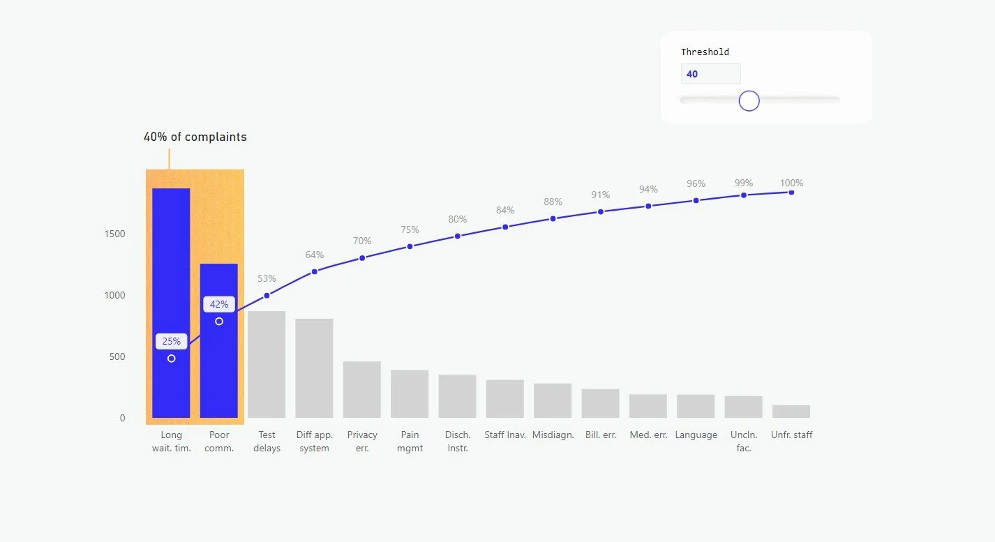
From self-help gurus to productivity professionals in corporate settings, many are fascinated by the elegant simplicity of the Pareto Principle - better known as the 80/20 rule.
It’s practically a religion when it comes to productivity and efficiency: focus your attention on 20% of tasks that generate 80% of the results.
In other words (for the perfectionists among us): aim for an 8 on many things, rather than a 10 on a few, or a 5 on everything.
We’re about to dive deep into the Pareto Analysis. By the end of this blog you will understand what it is and how applying it correctly can revolutionize your data design game.

Don’t visualize data, communicate it.
I was deep into a workshop with a few stakeholders. The kind that starts with chatty coffee and ends with quiet tension.
My client had asked for help designing a dashboard, but he also knew exactly what he wanted:
“Just show me the top 10 clients in a bar chart”.
Simple request. Familiar chart. I tried to push back, but he insisted on showing the clients in a bar chart. So I asked: “Why do you need to know this?”
We’d gone through this cycle a few times already that day, so he bristled. He just told me what he needed, so why did I keep asking him follow-up questions?
I could see he was offended, as if I were doubting his expertise.
It had been a long day, and the room stiffened.
But my intention wasn’t to challenge his expertise, I wanted to challenge the assumption that showing data is the same as communicating with it.
Because it isn’t. After some back and forth - him asserting what he needed, me gently doubting it - the real answer surfaced:
“I need this information on the dashboards. If we lose one of these clients, I need to understand the impact.”
And there it was. Not a ranking. Not a revenue snapshot.
It was a risk assessment guiding operations.
At it’s core it was a story about vulnerability, dependency, and strategic foresight.
A bar chart simply couldn’t tell that story.
So I dived into my data visuals library and found that, in this case, a Pareto chart could.
I got to work, redesigned the visual and when I showed him the shift from flat representation to actionable insight he finally softened.
He remembered why he’d asked for help in the first place: not to decorate data, but to design understanding.
The problem with bar charts
We’ve all used our fair share of bar charts. They’re often the starting point for visualizing ranked categories. Especially when we want to see a top N of something. Top 10 clients, top 10 performers etc.
And while bar charts are easy to understand and feel objective, they’re really just a projection of the data at hand. They’re highly sensitive to skewed distributions, and on their own, they often don’t tell us much beyond surface-level values.
A pareto analysis can identify the most significant factors contributing to a problem or outcome. I’m not saying it’s always the better (or best) alternative, but when root cause analysis is part of the goal, this is probably a go to option.
The Pareto chart allows us to quickly see which categories contribute most significantly to the overall effect.
Pareto Analysis: Origins and History
The Pareto Principle, named after Italian economist Vilfredo Pareto (1848-1923), has its roots in his observations of wealth distribution. In 1896, Pareto noted that approximately 80% of Italy's land was owned by 20% of the population [2]. This observation led to the development what we now call the Pareto Principle or the 80/20 rule.
Interestingly, Pareto's work wasn't widely recognized until the 1940s when Joseph M. Juran, a pioneer in quality management, applied the principle to quality control in manufacturing[1,3]. Juran coined the terms "vital few" and "trivial many," which are still widely used today.
The Pareto Principle, also known as the 80/20 rule, is not a strict mathematical law, but rather a pattern that is often observed in real-world phenomena. This pattern follows what is called a ‘power law distribution’.
We are getting into the maths here
A power law distribution is a type of mathematical relationship where a small number of factors or events account for a large proportion of the overall outcome or impact. In business terms: a few causes cause biggest part of the oucome.
Mathematically this can be expressed as:
P(x) ∝ x^(-α)
Where:
P(x) represents the probability of an event or factor occurring
x represents the value or size of that event or factor
α is a parameter that typically falls between 2 and 3 for phenomena exhibiting Pareto-like distributions
In plain language: the bigger the event or factor, the less likely it is to occur, but when it does, it has a much greater impact. This relationship has a specific pattern that is known as the long-tail curve of the Pareto Chart. That curve is a power law distribution.
In a power law distribution, large number of low-value events or factors occur rarely [13]. This is the basis for the 80/20 rule observed in Pareto analysis, where 80% of the effects or outcomes are typically caused by 20% of the factors.
By understanding and applying this mathematical principle, decision-makers can focus their efforts on the "vital few" factors that truly move the needle, instead of spreading resources thin across the “trivial many”.
It’s a smarter, more strategic way to solve problems and drive results across any domain.

The Pareto chart
A Pareto Chart is the visual embodiment of the.Pareto analysis, but it doesn’t necessarily follows the exact 80/20 distribution suggested by the Pareto Principle. The ratio can vary, and the chart usually doesn’t account for the probability of the event (i.e., “the larger the event or factor, the less likely it is to occur”).
Instead, the Pareto chart simply aims to visually identify he “vital few” factors that contribute the most, which may be more or less than 20% if the total.
Even though real-world data may not always fit this theoretical model perfectly. The key point is to identify the most significant contributors, the visual representation helps guide decision-making and resource allocation towards the "vital few" factors.
The chart combines a bar graph (showing individual values in descending order) with a line graph (representing the cumulative total).
Pareto Chart Pro’s
The Pareto chart is a useful tool for prioritizing factors. Reasons to use this chart:
Focus: By identifying the most important factors, Pareto analysis helps organizations or individuals focus their efforts on the most impactful areas.
Efficiency: Addressing the top 20% of factors can often lead to substantial improvements, making Pareto analysis a highly efficient problem-solving tool.
Prioritization: The Pareto chart clearly illustrates the relative importance of different factors, allowing for more informed prioritization of resources.
Communication: The visual nature of the Pareto chart makes it an effective way to communicate findings and recommendations to stakeholders (when sufficient design is added for communication).
While powerful, Pareto chart isn't always the best tool:
Pareto Chart Cons
Oversimplification: The 80/20 rule is a guideline, not a strict law. Some situations may not fit this pattern.
Ignoring minor factors: Sometimes, specific factors in the"trivial many" can have a significant impact. You can imagine that the risk of one death largely outweighs 10 broken legs.
Static analysis: It provides a snapshot but doesn't account for changing dynamics over time.
Correlation vs. causation: Pareto shows relationships but doesn't prove causality .
Subjective weighting: When using weighted Pareto analysis, the assignment of importance scores can be subjective and may not reflect the true impact of factors.
When to use the Pareto Chart
The general application of the Pareto chart is to identify priorities within categorical data. Pareto analysis helps determine the most important factors or issues within a larger set of variables. This could be applied to any decision-making process where there are multiple competing priorities.
It’s a powerful tool for decision-making, allowing individuals or organizations to focus on the few factors that drive the majority of impact, rather than spreading attention evenly across all variables.
Example use cases
Allocating resources: By focusing on the "vital few" factors that have the greatest impact, Pareto analysis can guide the efficient allocation of limited resources, whether it's budget, time, personnel, or other assets.
Process improvement: Pareto analysis is a powerful tool for identifying the most significant problems or inefficiencies within a process, allowing organizations to target their improvement efforts where they’ll matter most.
Risk mitigation: It helps prioritize the most critical risks or potential failures, enabling proactive and strategic risk management.
Productivity enhancement: When applied to personal or organizational productivity, Pareto analysis reveals the high-impact tasks or activities that deserve the most attention—helping you work smarter, not harder.
Advanced application
While the classic Pareto principle and the traditional Pareto chart are powerful analytical tools, there are several advanced applications of Pareto analysis that can elevate your data-driven decision-making. By incorporating more nuanced techniques, you can unlock deeper insights and more strategic prioritization.
Multi-level Pareto analysis: When dealing with complex, hierarchical data structures—where factors are nested—you can apply Pareto analysis recursively (i.e. get the 20% of the 20% etc.) at different levels. This helps uncover the “vital few” within each layer of the system, offering a more granular understanding of impact. [9].
Weighted Pareto analysis: The traditional rule assumes that all factors are equally important. But in realty, some factors may have a greater impact than others. Weighted Pareto analysis allows to assign customized importance scores or weights to different factors, providing a more nuanced prioritization. [14]
Pareto evolution: impact isn’t static. By tracking changes in factor importance over time, you can identify shifts in the “vital few.” Adding a line chart or similar visual alongside your Pareto chart helps reveal how priorities evolve—essential for dynamic environments and long-term strategy.
Pareto optimization: In multi-objective optimization problems, Pareto analysis can help identify the optimal trade-offs between competing goals. By mapping the Pareto front—the set of solutions where no objective can be improved without compromising another—you empower smarter, more balanced decision-making. [12]
Conclusion
Pareto analysis offers a powerful lens for identifying what truly matters. By focusing on the factors that drive the greatest impact, you can make smarter choices, allocate resources more effectively, and communicate insights with greater clarity. It’s not just about data—it’s about designing understanding.
Want to learn how to create the Pareto Chart in Power BI? Sign up for the tutorial calendar below and you’ll get access to the Pareto Chart Tutorial along with many ohers.
References
Juran, J. M., & Godfrey, A. B. (1999). Juran's Quality Handbook (5th ed.). McGraw-Hill.
Koch, R. (2011). The 80/20 Principle: The Secret to Achieving More with Less. Crown Business.
Bunkley, N. (2008). Joseph Juran, 103, Pioneer in Quality Control, Dies. The New York Times.
Reed, W. J. (2001). The Pareto, Zipf and other power laws. Economics Letters, 74(1), 15-19.
Craft, R. C., & Leake, C. (2002). The Pareto principle in organizational decision making. Management Decision, 40(8), 729-733.
Karuppusami, G., & Gandhinathan, R. (2006). Pareto analysis of critical success factors of total quality management: A literature review and analysis. The TQM Magazine, 18(4), 372-385.
Wilkinson, L. (2006). Revising the Pareto Chart. The American Statistician, 60(4), 332-334.
Sanders, R. (1987). The Pareto Principle: Its Use and Abuse. Journal of Services Marketing, 1(2), 37-40.
Kiremire, A. R. (2011). The Application of the Pareto Principle in Software Engineering. Louisiana Tech University.
Delers, A. (2015). Pareto's Principle: Expand your business with the 80/20 rule. 50Minutes.com.
Dunford, R., Su, Q., & Tamang, E. (2014). The Pareto Principle. The Plymouth Student Scientist, 7(1), 140-148.
Ultsch, A. (2002). Proof of Pareto's 80/20 Law and Precise Limits for ABC-Analysis. Technical Report 02/c, DataBionics Research Group, University of Marburg.
Barabási, A. L., & Albert, R. (1999). Emergence of scaling in random networks. Science, 286(5439), 509-512.
Cooke, R. M. (2014). Validating Expert Judgment with the Classical Model. In Experts and Consensus in Social Science (pp. 191-212). Springer, Cham.
Grosfeld-Nir, A., Ronen, B., & Kozlovsky, N. (2007). The Pareto managerial principle: when does it apply?. International Journal of Production Research, 45(10), 2317-2325.
Scrollytelling
Scrollytelling in dashboard design: when to use and when not to
Scrollytelling in dashboard design: when to use and when not to
The debate over the use of scrollable pages is ongoing in the world of dashboarding.
While scrollytelling is a proven effective way to engage users, many dashboards remain static. In this blog post, we’ll explore when scrollytelling is appropriate, delve into its trend and history, and discuss why dashboards are often static.
What is scrollytelling?
As the word says - scrollytelling is a technique that combines scrolling with storytelling,. In this design users can engage with content dynamically as they scroll. Unlike traditional scrolling, which simply moves the page up and down, scrollytelling integrates animations, transitions, and interactive elements to create a more immersive experience. The benefits include increased user engagement and improved information retention. Andtherefore it is one of the hottest UX trends in 2025.
Where did it come from?
Scrollytelling has its roots in digital journalism and data visualization. Early examples include interactive articles from media outlets like The New York Times, which used scrollytelling to present complex stories in an engaging way. Over time, this technique has been adopted in various fields, including UX design, to enhance user experiences. Scrollytelling emerged from the need to present complex stories in an engaging way. It has significantly influenced UX design by introducing new ways to interact with content. Early adopters in digital journalism paved the way for its use in various applications, including marketing, education, and data visualization.
Why are dashboards often static?
Static dashboards are favored for their simplicity, speed, and accessibility. They allow users to quickly access and interpret data without the need for additional interactions. This is particularly important in environments where time is critical, such as in business analytics.
However, static dashboards have their limitations. They lack the interactivity and dynamic presentation that scrollytelling offers, which can engage users more effectively. Without these interactive elements that guide the user through the story, it can be harder to highlight trends and patterns in data, which are often crucial for decision-making.
The benefit of scrollytelling in dashboarding
The interactive design is particularly effective when you need to tell a story that unfolds as the user scrolls. This is useful for data visualizations and presenting complex information in a digestible format. For example, a dashboard that tracks the progress of a project over time can use scrollytelling to highlight key milestones and trends.
When scrollytelling is a good choice
Scrollytelling is a powerful tool for creating engaging and interactive content that unfolds as the user scrolls. It is particularly effective when complex information should be presented in a difestible and engagin for,.
Here are some practical examples of how different user groups can leverage scrollytelling effectively:
Business Analysts: For business analysts, scrollytelling can transform quarterly performance reports into dynamic presentations. A scrollytelling dashboard might start with an overview of total revenue, then scroll to detailed breakdowns by department, and finally highlight significant trends and insights with interactive charts. This approach makes complex data more accessible and engaging, without the need for navigating to different pages or conducting analysis.
Education: In educational settings, scrollytelling can bring lessons to life. For example, a history teacher could design a timeline of significant events where students scroll through animated maps, historical photos, and key facts. This interactive format helps students better understand and retain information.
Healthcare Healthcare dashboards can use scrollytelling to present patient data in a more engaging way. A dashboard tracking patient recovery might start with an overview of the patient’s condition, then scroll through treatment milestones, and end with interactive charts showing recovery progress over time. This method makes it easier for healthcare professionals to monitor and communicate patient progress
Marketing Marketing teams can create compelling campaign reports using scrollytelling. A dashboard could begin with an overview of campaign goals, then scroll through various metrics such as engagement rates, conversion rates, and ROI. Each section can feature interactive elements that highlight key data points, making the report more engaging and easier to understand.
When scrollytelling is a bad choice
Simplicity and accessibility
For simple dashboards where users need to quickly find information, static pages are often more effective. Scrollytelling can sometimes complicate the user experience, making it harder for users to locate key data quickly. In these cases, simplicity is key, and a straightforward, static design can be more user-friendly.
Performance and load time
Scrollytelling can increase the load time of a page, which can be a disadvantage for users with slower internet connections. In such cases, static pages that load quickly and provide immediate access to information are preferable. Ensuring that your dashboard performs well for all users is crucial, and sometimes that means opting for a simpler, static approach.
When your tool has limitations
Sometimes, technical limitations or resource availability might prevent you from incorporating the most interactive features of a scrollytelling dashboard, such as animations or interactive elements. In such cases, you can still use scrollytelling by guiding users through the storyline, presenting elements and analysis in a logical order to maintain engagement and clarity.
Conclusion
Scrollytelling offers a powerful way to engage users and present data dynamically. However, it’s important to consider the context and user needs when deciding between scrollytelling and static pages. By understanding the strengths and limitations of each approach, you can create more effective and user-friendly dashboards.
Dashboard inflation
The real reason why your dashboards lack insight
In economics it is common sense: the more is of something, the less valuable it becomes. This idea is surprisingly relevant when it comes to creating dashboards.
The reason your dashboards lack
One of the most common issues with dashboards is that they contain too much data. While it might seem logical that more data would lead to more insights, the opposite is often true.
When a dashboard is cluttered with too much information, it can become overwhelming and difficult to navigate, ultimately leading to a lack of insights.

The paradox of information overload
This paradox can leave both developers and users puzzled. Despite the abundance of data, the dashboard fails to provide the necessary information. This is where the concept of “dashboard inflation” typically begins.
Users do not get the information they need from the existing dashboard. In response, they request more detailed data, which leads to an even more cluttered and less informative dashboard.
Over time, this can result in a dashboard that is no more useful than a complex spreadsheet, losing its intended purpose and effectiveness.

You need actionable insights
The core issue lies in the approach when adding data without considering how it translates into actionable insights. The real value of a dashboard is not the sheer amount of data it presents, but how well it suits the needs of the user.

An additional layer of complexity is that users often do not know what they exactly need to see from the data.
How to fight dashboard inflation
To combat dashboard inflation, it is essential to focus on what visualizations are necessary to provide the right insights, rather than simply adding more data. Here are some practical tips to help you achieve this:
Prioritize clarity over quantity: There is never a lack of options, so the magic word here is FOCUS. Focus on the most critical data points that provide insights that are needed. Avoid cluttering the dashboard with unnecessary details.
Ask the right questions: When users request additional data, ask them why they need it. Understanding their underlying needs can help you provide more targeted and useful information.
Simplify visualizations: Use simple and clear visualizations that are easy to interpret. Complex charts and graphs can often add to the confusion rather than clarify the data.
Iterate and improve: Continuously seek feedback from users and make iterative improvements to the dashboard. This ensures that it remains relevant and useful over time.

Conclusion
Dashboard inflation is a common issue that can significantly impact the usability and effectiveness of your dashboards, and can waste a lot of resources. By focusing on translating data into actionable insights and understanding the true informational needs of your users, you can create dashboards that are both informative and user-friendly. Remember, the goal is not to present as much data as possible, but to provide clear and meaningful insights that drive informed decision-making.
If you found this post helpful, don’t forget to subscribe to our newsletter to stay up to date about the world of dashboard design and data visualization!
Datavisual anatomy
The basics of a datavisualization

The elements that make up a data visualization
𝗔𝗻𝗮𝘁𝗼𝗺𝘆 𝗼𝗳 𝗗𝗮𝘁𝗮 𝗩𝗶𝘀𝘂𝗮𝗹𝘀
During my time at the Design Academy Eindhoven, one phrase was often echoed by the teachers: “Designing is making choices.”
10 years later I find that this wisdom rings especially true in the realm of data visualization. With countless possibilities, the challenge often lies not in what to add, but in what to leave out.
Creating effective data visualizations is a journey of decision making. From data selection, visual type, axis titles and tooltips, to error bands and dynamic formatting. The options seem overwhelming. Yet it are these very choices that shape the anatomy of your data visuals. Each element, carefully considered or consciously omitted, contributes to a clearer, more impactful story.
𝗦𝗼 𝘄𝗵𝗲𝗿𝗲 𝘁𝗼 𝘀𝘁𝗮𝗿𝘁?
Understanding the function of the different visual elements is essential, both for creating and interpreting data visualizations. It empowers you to make informed choices that align with desired outcomes. Moreover, a solid understanding of visual anatomy streamlines collaboration with co-creators, making discussions more productive and insightful.
In this guide, I break down the most common data visual elements and what their use is. For each element you should make deliberate choices about visibility, colour, size and where needed wording.
If you want to learn more tools to create and understand datavisualisations, be sure to subscribe to the newsletter!
𝗨𝘀𝗲 𝘁𝗵𝗲 𝗮𝗻𝗮𝘁𝗼𝗺𝘆 𝗶𝗻 𝟯 𝘄𝗮𝘆𝘀:
1. 𝘋𝘪𝘴𝘱𝘭𝘢𝘺𝘪𝘯𝘨 𝘪𝘯𝘧𝘰𝘳𝘮𝘢𝘵𝘪𝘰𝘯
Presenting your data effectively is the cornerstone of any visualization. This involves using charts, graphs, and maps to convey your message clearly. The development effort here is significant, as this is the core of your data visualization design. All other elements, such as labels, colors, and annotations, are there to support the information display and enhance understanding. Think of it as building a house: the structure (your data) needs to be solid before you can add the finishing touches.

Elements: x and y axis, data plot (lines, bars etc), error bars
2. 𝘎𝘶𝘪𝘥𝘪𝘯𝘨 𝘪𝘯𝘵𝘦𝘳𝘱𝘳𝘦𝘵𝘢𝘵𝘪𝘰𝘯
Helping your audience understand what they see is crucial. This means paying attention to units, quantities, and categories. Clear axis titles, legends, and tooltips can make a world of difference. These elements guide your audience through the data, ensuring they grasp the insights you’re presenting. It’s like being a tour guide in a museum, where your explanations help visitors appreciate the exhibits.

Elements: legend, axis titles, axis labels, gridlines, marker
3. 𝘗𝘳𝘰𝘷𝘪𝘥𝘪𝘯𝘨 𝘤𝘰𝘯𝘵𝘦𝘹𝘵
Context is what turns raw data into a compelling story. Consider factors like time, location, and other relevant details that can provide deeper insights. Contextual elements enhance the storytelling aspect of your visualizations, making them more relatable and meaningful. Imagine reading a novel without any background information on the characters or setting – it would be much harder to connect with the story. Similarly, providing context in your data visuals helps your audience connect with the information on a deeper level.

Elements: title, subtitle, tooltips, data labels
Conclusion
Mastering the anatomy of data visuals is a journey of continuous learning and refinement. By understanding and thoughtfully applying the various elements of data visualization, you can transform raw data into compelling stories that resonate with your audience. Remember, the power of a great data visualization lies not just in the data itself, but in how you choose to present it.
Embrace the process, experiment with different approaches, and most importantly, enjoy the creative journey!
Dashboard design: starting with an information architecture
It all begins with an idea.
Creating a dashboard is an exciting and multifaceted process. It requires not only technical expertise but also creativity and a keen understanding of business processes and user needs. A successful dashboard emerges from the interplay of data access, analysis, and visualization, providing valuable insights and enhancing decision-making within an organization.
However, there are two common pitfalls we often encounter. First, the focus can sometimes be too heavily on technical development, neglecting the visual aspect of the dashboard. Second, hasty or enthusiastic decisions can lead to a proliferation of dashboards without a clear purpose. These pitfalls can result in inconsistent and unused dashboards, which is a real shame!
How to avoid these pitfalls?
It starts with making the right choices. Before diving into technical development, we need to ask ourselves: What information is truly valuable to the user? What insights are needed to make effective decisions? And how does the user arrive at these insights?
This is where information architecture comes into play. A well-designed information architecture ensures that the right insights are delivered to the right place. It helps organize information so that it is findable, understandable, and relevant. Whether you’re familiar with the concept or it’s new to you, by the end of this blog, you’ll understand what information architecture is, why it’s important, and how to incorporate it into your development process.
What is information architecture?
In this blog, we focus on the front-end information architecture of a dashboard (not the data platform). This architecture determines how you navigate through the dashboard and what insights are available on different pages. It’s an overarching conceptual drawing of your dashboard’s structure. While it doesn’t specify the visualizations on each page, it does indicate the function of each page and where users can find specific information.
Building a dashboard is like building a house
The term ‘architecture’ says it all: information architecture functions like a blueprint when building a house. This design is created at the beginning of a project and serves as a guide throughout the process. It will likely undergo some adjustments before it fully meets the needs, and it can change during the process. Despite these changes, the architecture ensures that everyone involved knows the project’s direction.
Step 1: From a false start to a good beginning
Before you start designing the information architecture for a dashboard, it’s essential to have clear conditions. There are three crucial aspects we need to understand:
Objectives:
What goals should the dashboard and various reports achieve?
Engage with stakeholders to gather as many goals, needs, and wishes as possible.
Keep track of which goals belong to which stakeholder.
Select priorities and achievable goals.
Target Audience:
Determine who will ultimately use the dashboard.
Identify specific user groups and their needs.
User Needs:
What does the user need to perform their work effectively and achieve the set goals?
How can we support the user in this?
In short, start with clear goals, a defined target audience, and a deep understanding of user needs.
Step 2: The art of choosing
It’s intuitive to organize a dashboard based on the subject. However, one dashboard on the same subject can serve different functions for different users. Sometimes, it’s even necessary to create different dashboards for the same subject.
Now comes the step that is often perceived as overwhelming: How do you make choices for the dashboard layout? We use the inventory of goals, target audience, and needs from step 1 to make design decisions.
Determine the Decision-Making Level: Strategic, Tactical, or Operational?
Strategic: Focuses on long-term goals that define the company’s direction, usually set at the executive level. A strategic dashboard shows long-term progress, typically in the form of KPIs against targets.
Tactical: Involves the steps and actions taken to achieve strategic objectives. A tactical dashboard helps determine which actions or measures need to be taken to achieve goals.
Operational: Concerns the efficient execution of tasks. An operational dashboard helps automate and prioritize tasks.
Choose the Dashboard Functionality:
Based on the user group and decision-making level, you can choose a functionality. The dashboard can entirely answer this functionality, but individual pages or even parts of a page can also have different functionalities.
Types of dashboards
Landing:
Navigation and Overview: A landing page dashboard serves as a starting point for users. It provides an overview of available information and pages, helping users navigate to specific analyses or reports.
Reporting:
Storytelling with Data: The main goal of a reporting dashboard is to present data in an understandable and visually appealing way. This helps users understand and communicate trends, performance, and key insights.
Monitoring:
Real-Time Alerts: Monitoring dashboards alert users to critical situations or risks, such as deviations from normal performance or impending issues. Users are immediately informed where they need to intervene.
Analyzing:
Exploring and Discovering: These dashboards focus on analyzing and discovering patterns and trends. They offer various filters and drill-down options, allowing users to explore and delve deeper into the data.
Acting:
Executing Tasks: These dashboards indicate where attention is needed and what steps users should take first.
Step 3: back to the drawing table
Now that you have a clear understanding of the goals, the decision-making levels of the users, and the desired functionalities, it’s time to piece everything together into a structured whole: the information architecture.
Trust in the creative and iterative process as you sketch. As you continue drawing and developing, you’ll discover more about what is possible, what makes sense, and which choices are optimal. Don’t forget to gather feedback throughout the process.
By embracing this approach, you’ll create a dashboard that not only meets technical requirements but also truly serves its users, providing them with the insights they need to make informed decisions. Happy designing!
Feel free to reach out if you need further assistance or have any questions. I’m here to help!
Colorblindness in data design
Inclusivity in design is a hot topic, and for good reason. As data designers, we should aim to create visuals that communicate effectively to everyone. But when it comes to data visualization, color blindness presents a unique challenge.
Even if certain colors can be distinguished, the emotional impact might be lost, and with that the interpretation of the data at most, or the user experience at least.
In this article, you’ll delve into the nuances of color blindness in data visualization. Read further to understand how to create truly inclusive designs that convey your message effectively.
The use of color in Data Visualization
Color has a unique communicative role in data designs. It helps us differentiate between data points, making it easier to identify trends and patterns at a glance.
Imagine a graph without color, just black and white – it would be much harder to extract meaningful insights quickly. But if you add color and play with hues (i.e. blue, red, yellow) and value (i.e. light or dark), the storytelling can be emphasized.
From merely showing data points in a comprehensible way, you communicate a specific message. Changes in hue effectively describe differences in categories, while changes in lightness describe differences in value.

Beyond its functional use, color also carries emotional weight. Some colors communicate a sentiment of urgency, while others communicate a sentiment of success. By strategically using bold or contrasting colors, we can draw attention to the most critical information or signal action is needed.
In data design color is thus used for distinguishing data points, communicating sentiment, signaling values and showing trends. Different colors evoke different feelings and associations. A well-chosen color palette can make data not just understandable, but also memorable.
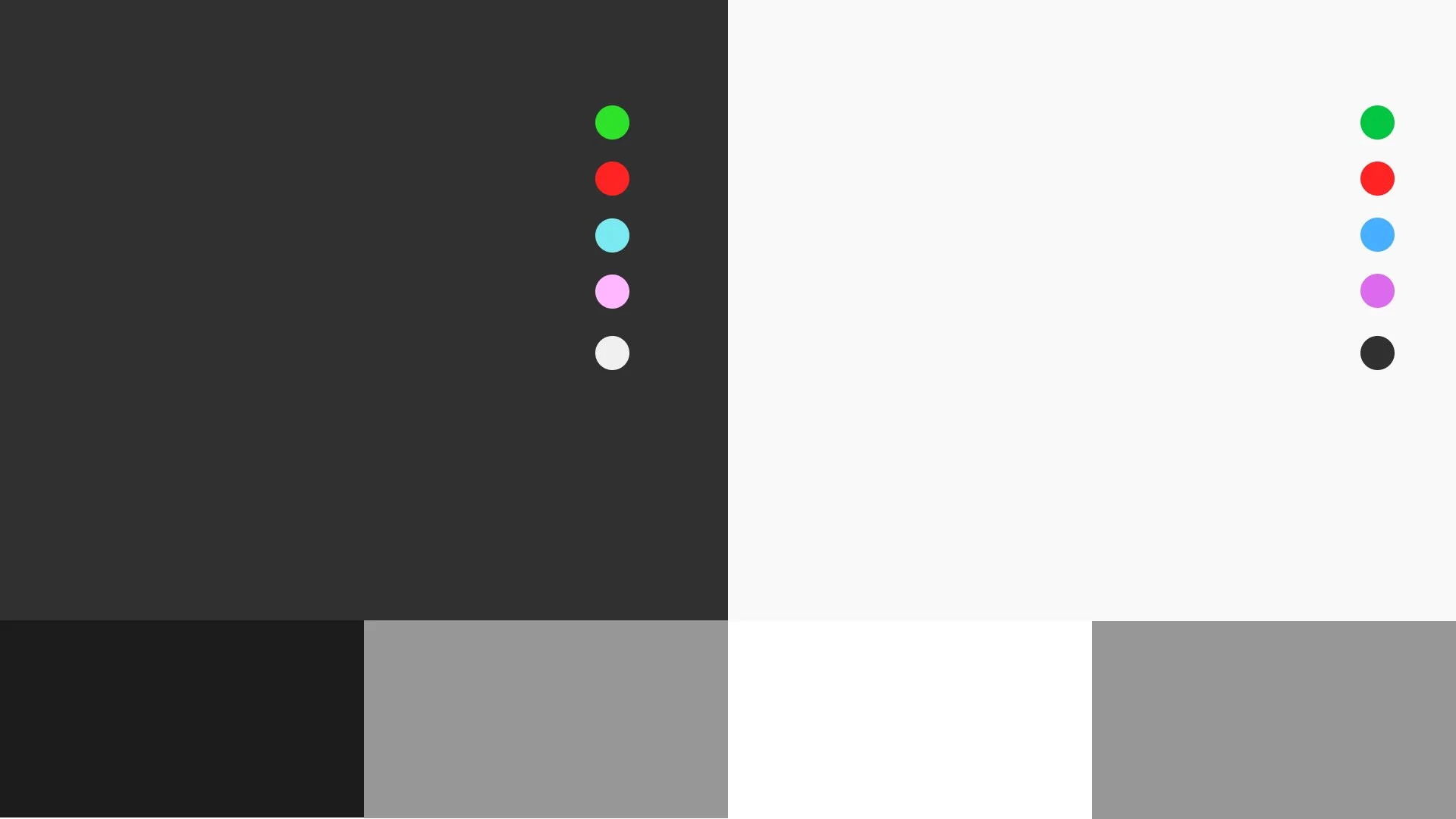
Understanding color blindness
When using color as an element of communication, inclusivity is a crucial consideration. With a significant portion of the population — approximately 1 in 12 men and 1 in 200 women globally — experiencing some form of color blindness, our choice of colors must ensure that everyone can interpret the data accurately. This means selecting palettes that are distinguishable to all viewers, not just those with typical color vision.
So where to start?
To create truly inclusive data visualizations, it's essential to understand the different types of color blindness and how they affect perception. While the severity and type of color blindness can vary, the most common forms are red-green color blindness, blue-yellow color blindness, and total color blindness.

1. Red-green color blindness: This is the most prevalent form, affecting the ability to distinguish between reds, greens, browns, and oranges. There are two subtypes: protanopia (difficulty seeing red) and deuteranopia (difficulty seeing green). People with red-green color blindness often see these colors as similar shades, making it challenging to interpret visualizations that rely on these hues.
2. Blue-Yellow Color Blindness: Less common than red-green color blindness, blue-yellow color blindness includes tritanopia (difficulty seeing blue) and tritanomaly (difficulty distinguishing between blue and yellow). This type affects the ability to differentiate between blues and yellows, which can also pose challenges in data visualization.
3. Total Color Blindness: Also known as monochromacy, this rare condition results in seeing the world in shades of gray. Individuals with total color blindness cannot perceive any colors, making it crucial to use other visual cues like patterns, shapes, and textures in data visualizations to convey information effectively.
How to answer to color vision deficiency?
1. Use high contrast colors: High contrast colors are easier to distinguish in both dark and light modes. Make sure there is a significant difference in brightness and saturation between the colors you choose.
2. Use multiple visual cues: In addition to color, incorporate other visual cues like patterns, textures, shapes, and icons. This ensures that even if the colors are not easily distinguishable, the data can still be interpreted accurately. For example, using different line styles or patterns can help differentiate data points in a graph., and using icons can communicate sentiment.
3. Use accessible color palettes: Choose color palettes specifically designed for accessibility. Ensure that your chosen palette maintains its clarity and effectiveness in both dark and light modes.
4. Provide text labels and annotations: Adding text labels and annotations can enhance clarity and accessibility. Clearly label data points, legends, and key areas of your visualization. Descriptive text ensures that the information is understandable even without relying on color.
Conclusion
By considering the needs of colorblind individuals and employing thoughtful design strategies, you can create data visualizations that are accessible and effective for everyone.
Ensuring inclusivity in design not only broadens your audience but also enhances the clarity and impact of your work!