
The Pareto chart: vital few vs trivial many
From self-help gurus to productivity professionals in corporate settings, many are fascinated by the elegant simplicity of the Pareto Principle - better known as the 80/20 rule.
It’s practically a religion when it comes to productivity and efficiency: focus your attention on 20% of tasks that generate 80% of the results.
In other words (for the perfectionists among us): aim for an 8 on many things, rather than a 10 on a few, or a 5 on everything.
We’re about to dive deep into the Pareto Analysis. By the end of this blog you will understand what it is and how applying it correctly can revolutionize your data design game.

Don’t visualize data, communicate it.
I was deep into a workshop with a few stakeholders. The kind that starts with chatty coffee and ends with quiet tension.
My client had asked for help designing a dashboard, but he also knew exactly what he wanted:
“Just show me the top 10 clients in a bar chart”.
Simple request. Familiar chart. I tried to push back, but he insisted on showing the clients in a bar chart. So I asked: “Why do you need to know this?”
We’d gone through this cycle a few times already that day, so he bristled. He just told me what he needed, so why did I keep asking him follow-up questions?
I could see he was offended, as if I were doubting his expertise.
It had been a long day, and the room stiffened.
But my intention wasn’t to challenge his expertise, I wanted to challenge the assumption that showing data is the same as communicating with it.
Because it isn’t. After some back and forth - him asserting what he needed, me gently doubting it - the real answer surfaced:
“I need this information on the dashboards. If we lose one of these clients, I need to understand the impact.”
And there it was. Not a ranking. Not a revenue snapshot.
It was a risk assessment guiding operations.
At it’s core it was a story about vulnerability, dependency, and strategic foresight.
A bar chart simply couldn’t tell that story.
So I dived into my data visuals library and found that, in this case, a Pareto chart could.
I got to work, redesigned the visual and when I showed him the shift from flat representation to actionable insight he finally softened.
He remembered why he’d asked for help in the first place: not to decorate data, but to design understanding.
The problem with bar charts
We’ve all used our fair share of bar charts. They’re often the starting point for visualizing ranked categories. Especially when we want to see a top N of something. Top 10 clients, top 10 performers etc.
And while bar charts are easy to understand and feel objective, they’re really just a projection of the data at hand. They’re highly sensitive to skewed distributions, and on their own, they often don’t tell us much beyond surface-level values.
A pareto analysis can identify the most significant factors contributing to a problem or outcome. I’m not saying it’s always the better (or best) alternative, but when root cause analysis is part of the goal, this is probably a go to option.
The Pareto chart allows us to quickly see which categories contribute most significantly to the overall effect.

Pareto Analysis: Origins and History
The Pareto Principle, named after Italian economist Vilfredo Pareto (1848-1923), has its roots in his observations of wealth distribution. In 1896, Pareto noted that approximately 80% of Italy's land was owned by 20% of the population [2]. This observation led to the development what we now call the Pareto Principle or the 80/20 rule.
Interestingly, Pareto's work wasn't widely recognized until the 1940s when Joseph M. Juran, a pioneer in quality management, applied the principle to quality control in manufacturing[1,3]. Juran coined the terms "vital few" and "trivial many," which are still widely used today.
The Pareto Principle, also known as the 80/20 rule, is not a strict mathematical law, but rather a pattern that is often observed in real-world phenomena. This pattern follows what is called a ‘power law distribution’.
We are getting into the maths here
A power law distribution is a type of mathematical relationship where a small number of factors or events account for a large proportion of the overall outcome or impact. In business terms: a few causes cause biggest part of the oucome.
Mathematically this can be expressed as:
P(x) ∝ x^(-α)
Where:
P(x) represents the probability of an event or factor occurring
x represents the value or size of that event or factor
α is a parameter that typically falls between 2 and 3 for phenomena exhibiting Pareto-like distributions
In plain language: the bigger the event or factor, the less likely it is to occur, but when it does, it has a much greater impact. This relationship has a specific pattern that is known as the long-tail curve of the Pareto Chart. That curve is a power law distribution.
In a power law distribution, large number of low-value events or factors occur rarely [13]. This is the basis for the 80/20 rule observed in Pareto analysis, where 80% of the effects or outcomes are typically caused by 20% of the factors.
By understanding and applying this mathematical principle, decision-makers can focus their efforts on the "vital few" factors that truly move the needle, instead of spreading resources thin across the “trivial many”.
It’s a smarter, more strategic way to solve problems and drive results across any domain.

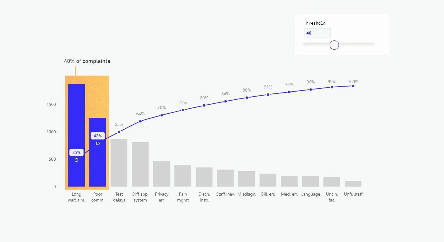
The Pareto chart
A Pareto Chart is the visual embodiment of the.Pareto analysis, but it doesn’t necessarily follows the exact 80/20 distribution suggested by the Pareto Principle. The ratio can vary, and the chart usually doesn’t account for the probability of the event (i.e., “the larger the event or factor, the less likely it is to occur”).
Instead, the Pareto chart simply aims to visually identify he “vital few” factors that contribute the most, which may be more or less than 20% if the total.
Even though real-world data may not always fit this theoretical model perfectly. The key point is to identify the most significant contributors, the visual representation helps guide decision-making and resource allocation towards the "vital few" factors.
The chart combines a bar graph (showing individual values in descending order) with a line graph (representing the cumulative total).
Pareto Chart Pro’s
The Pareto chart is a useful tool for prioritizing factors. Reasons to use this chart:
Focus: By identifying the most important factors, Pareto analysis helps organizations or individuals focus their efforts on the most impactful areas.
Efficiency: Addressing the top 20% of factors can often lead to substantial improvements, making Pareto analysis a highly efficient problem-solving tool.
Prioritization: The Pareto chart clearly illustrates the relative importance of different factors, allowing for more informed prioritization of resources.
Communication: The visual nature of the Pareto chart makes it an effective way to communicate findings and recommendations to stakeholders (when sufficient design is added for communication).
While powerful, Pareto chart isn't always the best tool:
Pareto Chart Cons
Oversimplification: The 80/20 rule is a guideline, not a strict law. Some situations may not fit this pattern.
Ignoring minor factors: Sometimes, specific factors in the"trivial many" can have a significant impact. You can imagine that the risk of one death largely outweighs 10 broken legs.
Static analysis: It provides a snapshot but doesn't account for changing dynamics over time.
Correlation vs. causation: Pareto shows relationships but doesn't prove causality .
Subjective weighting: When using weighted Pareto analysis, the assignment of importance scores can be subjective and may not reflect the true impact of factors.
When to use the Pareto Chart
The general application of the Pareto chart is to identify priorities within categorical data. Pareto analysis helps determine the most important factors or issues within a larger set of variables. This could be applied to any decision-making process where there are multiple competing priorities.
It’s a powerful tool for decision-making, allowing individuals or organizations to focus on the few factors that drive the majority of impact, rather than spreading attention evenly across all variables.
Example use cases
Allocating resources: By focusing on the "vital few" factors that have the greatest impact, Pareto analysis can guide the efficient allocation of limited resources, whether it's budget, time, personnel, or other assets.
Process improvement: Pareto analysis is a powerful tool for identifying the most significant problems or inefficiencies within a process, allowing organizations to target their improvement efforts where they’ll matter most.
Risk mitigation: It helps prioritize the most critical risks or potential failures, enabling proactive and strategic risk management.
Productivity enhancement: When applied to personal or organizational productivity, Pareto analysis reveals the high-impact tasks or activities that deserve the most attention—helping you work smarter, not harder.
Advanced application
While the classic Pareto principle and the traditional Pareto chart are powerful analytical tools, there are several advanced applications of Pareto analysis that can elevate your data-driven decision-making. By incorporating more nuanced techniques, you can unlock deeper insights and more strategic prioritization.
Multi-level Pareto analysis: When dealing with complex, hierarchical data structures—where factors are nested—you can apply Pareto analysis recursively (i.e. get the 20% of the 20% etc.) at different levels. This helps uncover the “vital few” within each layer of the system, offering a more granular understanding of impact. [9].
Weighted Pareto analysis: The traditional rule assumes that all factors are equally important. But in realty, some factors may have a greater impact than others. Weighted Pareto analysis allows to assign customized importance scores or weights to different factors, providing a more nuanced prioritization. [14]
Pareto evolution: impact isn’t static. By tracking changes in factor importance over time, you can identify shifts in the “vital few.” Adding a line chart or similar visual alongside your Pareto chart helps reveal how priorities evolve—essential for dynamic environments and long-term strategy.
Pareto optimization: In multi-objective optimization problems, Pareto analysis can help identify the optimal trade-offs between competing goals. By mapping the Pareto front—the set of solutions where no objective can be improved without compromising another—you empower smarter, more balanced decision-making. [12]
Conclusion
Pareto analysis offers a powerful lens for identifying what truly matters. By focusing on the factors that drive the greatest impact, you can make smarter choices, allocate resources more effectively, and communicate insights with greater clarity. It’s not just about data—it’s about designing understanding.
Want to learn how to create the Pareto Chart in Power BI? Sign up for the tutorial calendar below and you’ll get access to the Pareto Chart Tutorial along with many ohers.
References
Juran, J. M., & Godfrey, A. B. (1999). Juran's Quality Handbook (5th ed.). McGraw-Hill.
Koch, R. (2011). The 80/20 Principle: The Secret to Achieving More with Less. Crown Business.
Bunkley, N. (2008). Joseph Juran, 103, Pioneer in Quality Control, Dies. The New York Times.
Reed, W. J. (2001). The Pareto, Zipf and other power laws. Economics Letters, 74(1), 15-19.
Craft, R. C., & Leake, C. (2002). The Pareto principle in organizational decision making. Management Decision, 40(8), 729-733.
Karuppusami, G., & Gandhinathan, R. (2006). Pareto analysis of critical success factors of total quality management: A literature review and analysis. The TQM Magazine, 18(4), 372-385.
Wilkinson, L. (2006). Revising the Pareto Chart. The American Statistician, 60(4), 332-334.
Sanders, R. (1987). The Pareto Principle: Its Use and Abuse. Journal of Services Marketing, 1(2), 37-40.
Kiremire, A. R. (2011). The Application of the Pareto Principle in Software Engineering. Louisiana Tech University.
Delers, A. (2015). Pareto's Principle: Expand your business with the 80/20 rule. 50Minutes.com.
Dunford, R., Su, Q., & Tamang, E. (2014). The Pareto Principle. The Plymouth Student Scientist, 7(1), 140-148.
Ultsch, A. (2002). Proof of Pareto's 80/20 Law and Precise Limits for ABC-Analysis. Technical Report 02/c, DataBionics Research Group, University of Marburg.
Barabási, A. L., & Albert, R. (1999). Emergence of scaling in random networks. Science, 286(5439), 509-512.
Cooke, R. M. (2014). Validating Expert Judgment with the Classical Model. In Experts and Consensus in Social Science (pp. 191-212). Springer, Cham.
Grosfeld-Nir, A., Ronen, B., & Kozlovsky, N. (2007). The Pareto managerial principle: when does it apply?. International Journal of Production Research, 45(10), 2317-2325.